
How to design labels that make your products pop
3 min readDesigning labels that make your produacts look more appealing is a science in and of itself. You need to consider the colour, font and overall design of the label in order to create a look that will draw attention to your product. It can feel a little overwhelming if you have no previous design experience.
But do not worry, we have got you covered. In this article, we’ll explore some tips for designing labels that will make your products pop. We will break down each tip for you. Are you ready to learn all about stickers, labels and sticker sheet printing? Then let’s jump right in.
1. Keep it simple – avoid too many fonts or graphics
When it comes to product labels, simplicity is key. Too many fonts or graphics can be overwhelming and can actually detract from your product’s appearance. Or, worst case, the selling points you include will not be seen by the consumer.
A simple label also makes the product more memorable, as it is more likely to be remembered by the consumer than a complex one. This means that they are more likely to purchase your product again in the future.
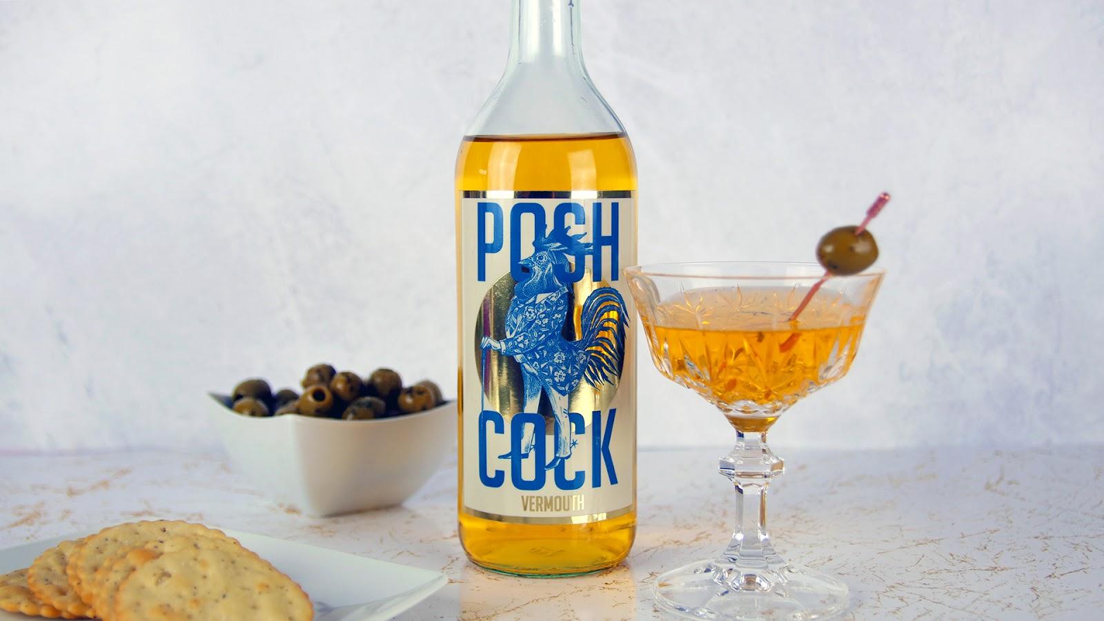
2. Use bright colours and effects to stand out on the shelf
Instead of fancy graphics, use your labels themselves to create eye-catching looks. Bright colours are always a winner. Be sure to consider what will work well with your product’s packaging when choosing colours for your label, You want to create a cohesive look that will grab attention.
Did you know that custom vinyl stickers are available in different materials as well? A holographic label or even a silver label can really elevate the presentation of your product and give it a luxurious edge.
3. Make sure your text is easy to read
Your label’s text should be easy to read so that potential customers can quickly and easily understand what your product is. After all, we only spend a few seconds skimming product labels, and you want to be sure that your customers can easily read your top selling points.
To do that, use a simple font and make sure the text is large enough to be legible from a distance. Consider using a bold or italicized font to add emphasis. Be sure that you opt for a minimum font size of 8pt to allow your text to print nicely.

4. Stick with a consistent branding strategy
Consistency is an essential principle of branding and marketing. If you use different fonts, colours and graphics on every product label, potential customers will be confused and may not be able to easily identify your products.
This means that they may end up purchasing a competitor’s product instead. Creating a consistent branding strategy will help customers easily recognize your products on the shelf and will make them more likely to purchase your product over a competitor’s.
There you have it! These are just a few tips for designing labels and custom stickers that will make your products pop. By keeping your design simple, using bright colours and effects, making sure your text is easy to read and staying consistent with your branding strategy. Which tip was your favourite? Let us know in the comments.